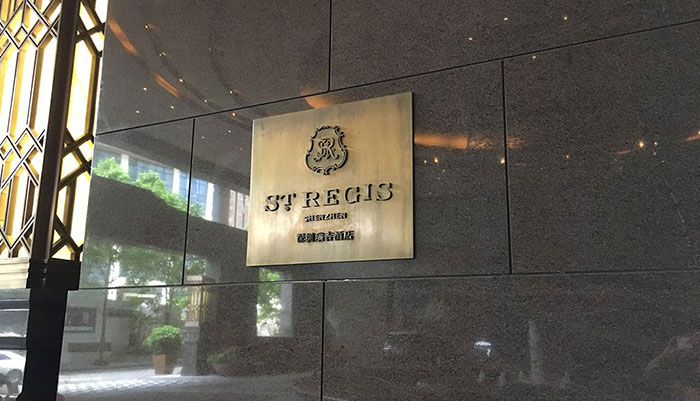
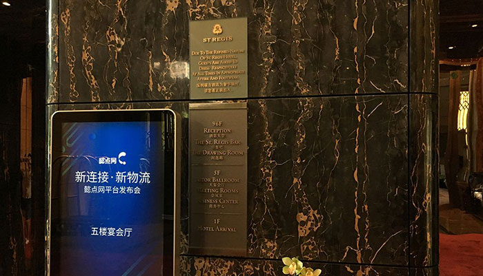
深圳瑞吉酒店标识设计的款式
深圳瑞吉酒店标识设计的款式
深圳超五星级酒店瑞吉酒店,是深圳的地标性建筑酒店大堂设在高层具有看到整个深圳的场景,他这里面摆放着千年不朽的艺术作品,整个设计与旋转四周能看到美景为主题,他酒店有290间客房以及豪华的装修。
在标识设计的时候,主要以青古铜结合装修的色彩搭配。瑞吉酒店标牌把瑞吉酒店展现的淋漓尽致。

新格躺在地板,然后配上筋骨疼的立体字。
The style of the logo design of the St. Regis Shenzhen
The St. Regis, a super five-star hotel in Shenzhen, is a landmark building in Shenzhen. The hotel lobby is located on the upper floor and has a scene of the whole of Shenzhen. There are thousands of years of immortal works of art displayed in it. The whole design and rotation can see the beautiful scenery. As the theme, his hotel has 290 rooms and luxurious decoration.

When designing the logo, the color combination of green bronze and decoration is mainly used. Show the St. Regis hotel vividly.
Xinge lay on the floor, and then added a three-dimensional character with painful muscles.

人和时代设计
品牌设计、VI设计、标识设计公司


